Art text can often leave audiences scratching their heads and wondering what the blazes they mean.
The Independent ran an article (Why it’s time for galleries to drop the jargon) a couple of weeks ago about tongue-twisting but often repetitively impenetrable language used by galleries, from the exhibition-on-cafe-walls to the power houses of the Tate.
This is something I’ve been banging on about, well, since I started marketing for theatres and art centres. The worst offenders seem to be contemporary art and dance, probably because they are trying to put into words what is indescribable through verbal language – we are to be interpreted, enjoyed and challenged through the medium of art or movement.
And often because the copy is written before the exhibition or dance piece is even created…
“…And when you went to see the art, you might even wonder if the people who were using language you couldn’t really understand were trying to hide something: and that what they were trying to hide was the fact that the work, which they wanted you to think was clever and interesting and worth thinking quite a lot about, often wasn’t clever of interesting or worth thinking quite a lot about.” said The Independent’s Christina Patterson.
I can relate to Christina’s words: in 2010 on spec I viewed an exhibition by eminent photographer Wolfgang Tillmans at the Serpentine Galley – and was thoroughly unimpressed. There was an awful lot of ‘challenging methods of production’, ‘subverting traditional hierarchies’ and ‘deconstruction’ which appeared to be a fancy way of saying ‘Wolfgang couldn’t be bothered to spend money on decent reproduction so printed out his stuff on his desk top printer and stuck it on the wall with Sellotape’ and thought it would be fun to stick a cheap camera phone up his dressing gown and take a picture of his naked private parts. Yawn.But how to describe a piece of art which is abstract and at first glance appears to be a bunch of gloomy brush strokes but then one returns to it time and time again just to stare at it, sucked into its unsettling world?
At this point the marketeer (like myself) has to make a call. They have to either stick to talking interesting facts about the artist or give their own interpretation that caters to the average gallery punter (and not the art student or lecturer – they can buy the critical essay).
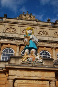
Here’s how I described Daimen Hirst’s Charity – a twenty foot bronze sculpture that lived on the balcony of the Royal West of England Academy’s balcony for a year – as reported by BBC news:
“The statue, called Charity, is of a collection box of a girl with teddy bear and her leg in callipers. The RWA said Bristol-born Hirst has “scuffed her appearance and burgled her charity box to highlight the erosion of society’s values”.
That quoted sentence was used by local and national media alike, simply because it’s easy to read, doesn’t patronise its readership and has respect for the role of the word in describing a piece of visual art – ie great care has to go into the crafting of the words to do justice to a great piece of work.
It also ultimately understands that – for most people – seeing art is not about being on some higher plane of existence, but gives them and their brains something to do at a weekend or lunchtime.
There are two lessons that stand out for any business or organisation attempting to describe what they do to encourage people to participate or consume what they do: don’t bamboozle people with words and expect them to know nothing.

